Monday, 28 February 2011

Today's Review: Homemade Burgers

Meat. What is your response to that statement? If it's anything other than "Yumz" then you are wrong. Meat is good. Tonight I ate meat. But to just eat a hunk of meat would be barbaric, so I smooshed the meat up into patties. That's what you call a burger.

When life gives you lemons, slap meat on top of them
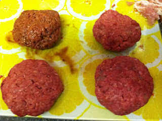
Tonight's menu consisted of four burgers. I slapped them around as best I could to get them even, but in the end I didn't really care. This isn't Masterchef, it's Meaterchef. Four plain burgers ain't good though, so I added some extras.


On the top left we have meat infused with Jack Daniel's barbeque sauce. 'Cause why have sauce on top of your burger when you can have it inside? Under that is meat with a small block of cheddar. 'Cause why have cheese on top of your burger when you can have it inside? Right of that we have the bacon burger, 'cause why have bacon on top.... You get the picture. The top right has Nando's hot Peri Peri spices inside. I was going to be disgusting and do a peanut butter burger, but I forgot to buy peanut butter.

After much meat slapping, and making some burgers (ha, I made an innuendo and a poor food hygiene reference), under the grill they went. That's the beauty of making burgers. It's quite simple. It appeals to our very human urge to squeeze things into smaller things and then eat them. At least, I assume everyone has that urge.


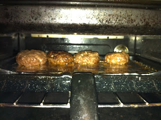
Here they are cooking. I put some foil down because that's the sensible way to grill. There is a danger of the grease that leaks out catching fire if you cook for too long, but that just creates a funny story to tell later. Speaking of which, did I tell you about that time I had to carry a flaming grill to the kitchen sink to put out the fire? That shit was hilarious.

Soon, they were cooked. So I ate them. First I pu them on a plate, and put a couple in some buns. I probably should've added some fries for some variety, but I was too wound up in a meat frenzy to remember to cook them. So it was just me and the meat.

The spicy burger was okay. I prefer the ones I normally make that have a whole crushed ghost chilli, although they tend to make my mouth hurt with searing pain. 


There's the barbeque burger. Looks quite professional in the picture, apparently I take pictures good. What turned out to be a massive dollop of sauce in the preparation stages didn't turn out to be too bad. It was smokey, and not too sloppy. But after the halfway point, shit got real.


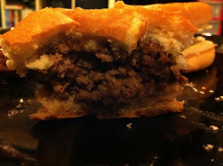
The bacon burger. This picture looks even more awesome than the last. Look at it. It's a meat beast. The only apparent purpose of the bun is to be able to hold it without getting grease on your hands. And that's what bread's purpose should be. In my opinion, the only thing better than meat is more meat to go with the first lot of meat. This burger was meaty, and everything's better with bacon.


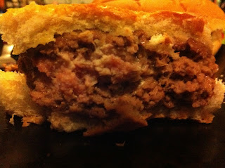
Finally, my masterpiece. This is the burger I revisit every time I make them. Just get a block of cheese, wrap it in meat, cook it lap up the results. Cheese goes with even more stuff than bacon goes with. Without cheese we would merely be carnivorous animals. This burger is a delight to eat. First you get the juicy meaty flavour, and suddenly it's topped off with the ultimate combo maker of warm melted cheese. It makes me feel happy inside.

Burgers are good for the soul. They fill it with meat and joy. My burgers, while not of amazing quality, are good enough for a cheap meal. Just try it. Toss in some cheese, some sauces, garlic, even peanut butter (seriously, peanut butter burgers are pretty damn nice), slap some patties and grill up a good time.

My rating: 4/5


Sunday, 27 February 2011

Today's Review: My Walk Home

I'm on the way home from work right now, blogging on my iPhone. Ahh, the future. My eyes are getting watery from the wind but dammit, I'm determined. It's a dark night, the streets are empty save for some straggling revellers. But for me, it's home time.

My colleague has left me for different pastures and I find myself quite alone. On my left now some kind of homosexual based night is happening. People are talking too loud. And cackling. Fucking drunks. Thankfully the streets are well lit at this point, and there appears to be a police presence. My phone is shining brightly and I'd rather it not be nicked.

I just crossed the road without waiting for the green man. This is because I live life dangerously. Unfortunately the manly effect of my actions were cut short by me almost walking into a phone box. You win some, you lose some.

I'm straying towards the edge of town now. My hand is getting cold, but I won't let you down, dear reader. The giraffe toy we gave to a charity shop the other day has earned a place in the front window. That makes me feel special.

Walking sucks. The only good thing about it is it's free. But the multitude of takeaway places tempt me with their fumes. For some reason my phone is now not showing me what I'm typing, it's skipping higher up the page. I am displeased. I just almost walked into a bush. And stepped off a curb I didn't see. But still, I'm manly. Many more roads have been crossed without looking both ways. Soon I shall be home. Perhaps I'll pop in and see the hobo who's taken up residence by the bins. But probably not, that'd be creepy. My walk home has been very uneventful, but the darkness adds a sense of danger that is thrilling. Will I be mugged? Murdered? No, probably not. But I might walk into a bush one day.

My rating: 3/5

Saturday, 26 February 2011

Today's Review: My Wallet

Working in Blockbuster, I see many people's wallets, and their consistent effort to find their membership cards that are buried within. When I see these people struggle through their multitude of unnecessary cards that are wedged uncomfortably into the dividing pockets, I chuckle to myself and pity their existence. For in my pocket, I know I have a better wallet than they'll ever have. My wallet is at the pinnacle of human engineering and organisation skills. If my wallet were a work of art, it would be a modern piece, as a picture of a wallet probably wouldn't be too popular in the 18th century.


Here is my wallet in its most dormant state. "Wait a minute..." I hear you say, and yes indeed, you are right. My wallet looks like a NES controller. Just wait 'til I open it up:


BAM! Mind: Blown. Underwear: Soiled. In a good way. With pleasure mess. Sometimes I just like to stand there and pretend like i'm playing this baby like it's a real controller. The looks on people's faces could be construed as concern for my mental health, but I know it is clearly jealousy. But it's not over yet. Not only does my wallet look amazing, the guts hold infinite pleasures.


Look at my wallet. LOOK AT IT! I could tell you without a shadow of a doubt where everything in my wallet is. Everything is sorted according to category and frequency of use. At the top left, you will see what I like to call the "see through flap bit". It is the first point of contact upon opening the wallet, the topside of which has 3 more pockets reserved for my Oyster card and any travel based tickets I am using on that particular day. After they are invalid they are cast into the inside left pocket until the time comes to add it to my entirely useless collection of train tickets. The underside holds a picture of me and my family, to distract people with the image of my children and devolve them into cooing simpletons. One day, when I learn to drive, I may place my licence into this see through pane, but only so any time i'm pulled over the conversation will go like this:

Me: Good day Officer.
Officer: Do you have any idea why I stopped you?
Me: Why, I haven't the foggiest.
Officer: You just drove into a shop window, and while reversing out you knocked down and mortally wounded an elderly person. Also you are swigging Jack Daniels and lighting up a doobie.
Me: Oh, that is a shame. Here is my licence and registration.
Officer: Thank y... Are they your kids?
Me: Yup, two little angels.
Officer: Oh my, they're soooo cute. But they can be little terrors can't they?
Me: Oh, tell me about it. But what can I say? I love 'em.
Officer: My heart is so full of joy that I forgot why i'm standing here. Have a safe ride home.
Me: Thank you Officer.


Underneath the flap is where the real treasure lies. In the most used slot we have my debit card and Tesco Clubcard. I at first went to take a picture of the entire debit card, before I realised that a) most of my card details would then be online, and b) i'm not a moron. Using only one hand I can take the wallet from my pocket, open it, lift the flap and slide my debit card out with my thumb, an act that instantly increases the awesome rating of any transaction by 300% (citation needed). In the next slot I store my credit card, for those times when I want something but can't afford it within my means, and my CeX card, which I use to trade electronic items for other electronic items. My passion for electronic items ranks this card highly in the realm of my wallet.


The other side of the wallet is somewhat bare. In the top slot I have a coule of library cards, rarely used because reading is for nerds, or rather a different class of nerd than myself. The next slot, however, holds a cornucopia of loyalty card delights. There's one for every occasion, if that occasion happens to be coffee or chicken based. Yes, I have two Nando's cards. I found one on the floor once with two stamps on. I get a free 1/4 chicken next time. That's how I roll. 

But wait, it's not over yet:


Here's where the notes go. I don't have any at the moment, because cash is archaic in this electronic age. But even when no notes are present, the main pocket of the wallet shines with the radiance of Super Mario coins. That's right, my wallet somehow got more cool. This pocket is also home to my 16-25 railcard, contained in its own plastic wallet the does not fit in any other place in the host wallet. At times I rue its existence, but I recognise its necessity, and it has learned to accommodate its space with minimal disruption.

My wallet contains no unnecessary cards, and is perfectly arranged for every time at which it is needed. Unworthy items may linger a certain points, but they are swiftly disposed of in order to streamline this magnificent feat of organisation. So next time you're digging through old receipts and business cards for that place you went to once that was kind of cool, just think "how can I make this wallet more awesome, like that one I saw on that blog one time?" If everyone had a more organised wallet, the world would be a better place.

My rating: 5/5


Friday, 25 February 2011

Today's Review: Birdseye Chicken Dippers

Tonight I had the pleasure of indulging in the height of the haute cuisine of the child world. My experiences were at once exciting and delightful. My foody nature has often led me into undiscovered avenues of culinary pleasure, and tonight was certainly no exception.


The Birdseye chicken dipper promises 100% whole chicken breast in a golden and crunchy batter coating. At first glance it is abundantly clear that this food was elegantly designed in the shape pertaining directly to its name. Indeed, what is a chicken dipper without its ability to dip? The smaller end creates an easily graspable point at which to lift the dipper and delve it directly into the depths of your favourite condiment. Normally in this scenario I would opt for a light vinaigrette, but to fully endorse myself into the culture I went with the "vogue" sauce of the moment, tomato ketchup. As a side to the main meal, I chose a spread of thinly sliced and lightly fried potato, supplied with the utmost care and passion by the illustrious McCain company.

Presentation is everything. EVERYTHING.


A wise choice indeed. I have heard rumours of chicken dippers being served with stewed haricot beans steeped in a tomato sauce, but everything in moderation I say. Too much tomato can be extremely unforgiving on the palate. The "French fries" were not among the best i've tasted, the separate ventures of the upstanding Colonel Sanders and Ronaldo of the McDonald estate are simply far ahead of any competition. But in this case, the McCain fry was a perfect accompaniment to the dipper, which in itself was not without its faults. The creator of the dippers, a noble sea captain who has lent his name to the franchise, seems to be leading a rich lifestyle afforded to him by the immense popularity of his dish in the under 10s market.

At first glance it is clear that there is far from 100% chicken breast in this dish. Indeed, upon examining the recipe I found in fact that chicken constituted only 50%, while the rest was the various flavourings and breadcrumbs that constituted the batter. This ratio is a transgression in my eyes, but the batter itself lends a certain je ne sais quoi to the proceedings. The dipper is crunchy, slightly greasy, but eternally satisfying once it gives way to the juicy chicken treasure inside. In keeping with the traditional method of consumption, I forwent cutlery and delved straight in with my hands for full on digital pleasure. The grease was constricting at first, but I found my plate to be empty in no time at all. One may ask where on a chicken are its dippers, but I say that they are philistines, and are clearly ignoring the centuries of culture and tradition surrounding this dish.

My rating: 4/5


Thursday, 24 February 2011

Today's Review: Paranormal Activity 2

Here's how the story goes. Someone makes a fresh and original movie, everyone loves it and it makes buttloads of money. "That was pretty cool," thinks Hollywood, "let's make another one!" Everyone goes to see it, then moans that it wasn't as good as the original. Every. Single. Time.

Paranormal Activity 2 is the newest horror movie in the "found footage" style, brought into the mainstream with The Blair Witch Project over 10 years ago and attempted by many ever since. There have been a few good efforts, such as the monster movie Cloverfield and the Spanish zombie film REC, which a lot of people refused to watch 'cause it was Spanish. So they remade it in American. Sigh. Anyway, Paranormal Activity has clearly been the breakaway hit of the genre. Filmed on a budget of just $15,000, it made a shit load more of that. So here we have the sequel in all its Hollywood £3m budget glory.

The story basically involved a family who have weird shit happen to them in their house, so they install a load of cameras to check out what's going on. Then even more weird shit happens. It's a ghost, y'see, or is it something else? We'll just call it a ghost, it's a thing you don't see that moves stuff. So the family gets increasingly freaked out, freakier shit happens and it all builds up to the climax. But while there is a clear progression of the tension throughout the movie, it doesn't let you calm your nerves. See, Paranormal Activity did something within the genre that hasn't been done much before, but is so simple. They left the camera in one place. All the stuff happens at night, and it's all in one take. Most horror movies provide you with certain camera angles, musical cues etc. that let you know something's gonna happen, but Paranormal Activity took all these cues away and just made things happen whenever it felt like it without letting you know in advance. That is why it's so scary, and that is why people loved the original.

It's also part of the problem with Paranormal Activity 2. In the first movie there's the one camera. It's either staying still at night or being carried round during the day to examine weird stuff. In the second movie there are 7 cameras, and cuts frequently happen between them. While stuff can still happen at any time, the tension is greatly reduced by the amount of times your attention is shifted somewhere else. Another thing, probably due to the influence of Hollywood, this feels more like a movie. It's still well done, but from the moment you see the main female and think "Huh, that's the chick from 24" it loses its authenticity. Add that to the fact that one of the characters from the first movie is introduced with big white text basically saying "THIS IS THE GUY FROM THE FIRST ONE", and the way that the family leave their branded food products all over the place and seem to watch a TV channel that only airs adverts, something just doesn't seem right.

Still, Paranormal Activity 2 is good. It still has a good amount of scares, but more straying towards the "things that go bump in the night" instead of some of the weirdness seen in the original. One thing I don't get is why the ghost goes through so much stuff before he goes after the prize. I assume there's some kind of spiritual level up system. Move enough doors slightly, and you can make a bump. Make some of those and you can knock down a pan. I know, I know, it's to advance the plot, but that ghost is just a drama queen.

There seem to be a few cheap shots thrown in, such as the only person knowing anything about spirits being the Mexican housemaid, and the addition of a baby seemingly just to make people think "Oh shit, what's gonna happen to the baby?", but I jumped quite a lot throughout and the tension still doesn't really let up, despite the glaring flaws. It's building on the tried and tested formula of the original, and for once Hollywood didn't screw it up beyond repair. The ending does trail off a little to be predictable and lame, but as I say, it's about the journey, not the destination.

I don't see how they could make the jump from a $15,000 budget to £3m by adding a few more actors and cameras, so i'll take some for my rating. Also because the franchise is a cash cow. See? It works on two levels.

My rating:

Wednesday, 23 February 2011

Today's Review: Barbie as The Island Princess

I've lost control. My daughter is too independent. I've spent the last 3 years providing her with top notch quality animated movies, rarely straying from the Disney and Pixar route. But now she can choose her own, and now I have to prepare myself for the massive stream of unadulterated crap i'll be forced to watch over and over in the coming years.

Amelia is majorly into two things: Thomas the Tank Engine and princesses. I can handle a bit of Thomas, it's good fun some of the time, but the danger with the topic of princesses is it can easily cross from top quality Disney style to anyone else who wants to have a go. Something which the Barbie franchise seems intent on doing.

Barbie as The Island Princess starts out with some animals discovering a girl on the sandy beach of their tropical island, and deciding to take care of her. Flash forward ten years and the girl is all grown up and happily playing with her lifelong friends:


Her friends, of course, being a baby elephant, a peacock and a red panda. As an adult I can't help but wonder, how the hell did all these animals become friends? How did they all wind up on the same island? How did they adequately raise a child into a responsible young woman? Where is that baby elephant's mother? WHY WON'T THEY STOP SINGING AND ANSWER ME?! Meanwhile the children just got even happier. Barbie, princesses and talking animals? This is like, the best movie ever!

Her name isn't Barbie though, it's Ro, because that's what the trunk she was washed up with says on the front (the rest of the name being washed away, conveniently). Apparently during the shipwreck in her early childhood she wanged her head pretty hard, because she can understand and talk to animals. I like to imagine it's a delusion as result of brain damage, it's more fun that way. Anyways, everyone's happy until one day an explorer shows up:


Oh, isn't he handsome? Look at those narrowed eyes. That means he's cool. Plus he has a ponytail. Oh, and did I mention he's a prince? Of course he is. This film has "princess" in the title, and the only thing a princess wants is a man to whisk her away. And whisk her away he does. Upon encountering some strange hermit girl on a remote island who believes she can communicate with animals, this guy just thinks "Eh, that's pretty cool, i'll take back to my place". Ro loves the idea, so back they go. I can understand how the peacock and panda couldn't quite teach their castaway about stranger danger, but a prince should know better. 

So they arrive at the kingdom of Apollonia (it's exotic because it has a weird name). Antonio introduces Ro to his parents, King Peter and Queen Danielle. Okay. Two boring named people decided to name their son something exotic. I can live with that. But also the king and queen have stuffy English accents, while Antonio is American. Makes perfect sense. But we know that Antonio is indeed the king's son.


They have the exact same face. "Hmm," thought the animators, "how do we make sure no one notices our laziness? I know! We'll give him facial hair. Now he's definitely a different person". While Antonio's been away, the king's been setting up his marriage, 'cause he's tired of his son wandering off on adventures and making him feel like he's done nothing special with his life. Trouble is, the mother of the bride-to-be is Ariana, this woman:


Oooh, you know she's a baddie, 'cause she's got a beauty spot and big hair. Turns out your initial assumption are correct, she's using her daughter to kill the royal family and take over the kingdom! Zomg! And she would have gotten away with it too if it weren't for that meddling weird girl who talks to animals. The prince doesn't believe in marrying a woman that she just met, he'd rather marry the girl he met the day before, because she's "different". Yes, Antonio, she's crazy and talks to animals. But by some strange coincidence she is also perfectly beautiful, must have been some good dentist animals on her remote island paradise. So, Ariana conjures up a plot to get rid of Ro once and for all. She poisons all the animals on the island, and blames it on the new girl. Off to the dungeon with her!

Will Ro escape her unjust imprisonment? Will the animals be safe? Will the evil woman get her comeuppance, and will Ro conveniently find out she's a lost princess and therefore eligible to marry her new love? The answer to all these questions is yes. Sorry for the spoiler, but the clue's in the freakin' title.

It's predictable, it's not amazingly animated, everything about this movie is sub par. But no one was trying to make an Oscar winner here, they just want to make little girls bug their parents until they part with all their hard earned cash. But joke's on you guys, I rented it for free. Now if you'll excuse me, I need to go and buy a singing baby elephant.

My rating: Seriously, bad, really bad. But at least someone liked it...

Amelia's rating:


That picture's from the deleted scene in which Ro sits astride her elephant and takes out the competition.

Tuesday, 22 February 2011

Today's Review: Paul

I went to the cinema last night. It doesn't happen that often, as the cinema costs money and I get all the free movies I like from work. But still, some movies just demand the cinema experience, such as the 3D ones and the over the top summer blockbusters. Paul may not demand it quite as much, but I had a gift card, so hey, why not? And apart from the guy who decided it would be hilarious to fart every time it was quiet, it was enjoyable.

Paul is the latest movie starring Simon Pegg and Nick Frost, after the British comedy classics Shaun of The Dead and Hot Fuzz. Not to be lumped in with these two though, as their regular collaborator Edgar Wright is not involved with this one, he was off making another awesome movie. Don't worry though, he'll return to finish the Blood and Ice Cream trilogy, but the question remains as to whether Pegg and Frost can hold up the high standard of work without Wright's presence. 

Paul is about Graeme and Clive, a couple of British nerds who visit ComicCon one year before taking a road trip through all the famous American extraterrestrial landmarks. On the way they meet an alien, and hilarity ensues. The plot sounds a little bland, but this is Pegg and Frost we're talking about, so it's far from ordinary. In this case, the alien is a foul mouthed little dude voiced by Seth Rogen. That's pretty awesome. Together they drive their R.V. through the great American desert in order to save Paul from the secret agents pursuing him so he can go... somewhere. It's never really mentioned exactly where he's going throughout the film but it's not hard to deduce. Along the way they pick up a mightily Christian woman named Ruth, whose faith is shaken upon meeting an alien and who therefore decides to sin it up in the absence of the ever present eye of God. 'Cause, as Ricky Gervais proved before, there's nothing better than an English person working their way up to a big Hollywood production and promptly using it to take the piss out of religion. Right on. 

The result is a good old fashioned chase film, except with a foul mouthed alien who smokes weed. The characters all intersect and trip over each other in order to get their job done, and it's very well interweaved every step of the way. The only problem with having such a varied ensemble cast is that much of the characters' backstories is lost, and the only real characterisation that occurs is within what's happening during the film. But that's really a problem with every ensemble cast, not just that of Paul.

Paul is a much more accessible film than Pegg and Frost's last two outings. All the references to the genre they're trying to honour are still there, this film is very much a love letter to science fiction, but the humour isn't just based around that area. Still, it's fun to sit there and pick out all the nods to other movies that you recognise. The final product turns out to be a very good balance of parody, slapstick and straight dirty jokes. In essence, there's something for everyone. The philistines in the audience can laugh every time someone mentions testicles, while the discerning nerd can roll their eyes and guffaw while thinking "Hey, look, a Star Wars!"

Paul is not without its flaws, however. Some of the running jokes get stale quite quickly, such as the constant assumption by everyone they meet that the two main characters are gaying it up, or the constant rattling off of books written by a famous sci-fi author. Okay, I get the joke, but it's not much funnier the fifth time I hear it. But hey, this is Hollywood. Here jokes are pumped out until their dead, then the corpse is flowered with titties and penises.

Despite this being very much a Hollywood standard production, Pegg and Frost have done a very good job retaining the... Britishness of it all. This isn't an American movie about two weird foreign guys and an alien, nor is it a British movie about two guys in a land full of weirdos. There's a perfect balance between British and American stereotypes, but the landmark British parody of Hollywood as so effectively demonstrated in Shaun and Hot Fuzz is still ever present, and perfectly summed up by the final line of the film in fact. 

All in all, a good time to be had by all. Even if someone's farting all the way through, you're likely to enjoy it.

My rating:

Monday, 21 February 2011

Today's Review: Oxygen

Everyone needs to breathe. Which is a shame, because cyborgs don't, and I feel that's a major weakness that they can exploit when attempting to take over Earth. Although they need electricity, so I think we've just about got the upper hand there. But wait, we also need to drink, eat, expel waste and not fall on spiky things to live. Crap, we're doomed.

Aaaanyway, oxygen is what we breathe, and we breathe it every day. There's no avoiding the stuff. But how much do we actually know about oxygen, what do we actually think of it? I feel like i've taken it too much for granted, so here's my two cents.


Here's a picture of oxygen I found on the internet. I tried to take a picture, but it's not very photogenic. Don't be fooled by its striking similarity to Iron Man's arc reactor, because it's actually not awesome at all. Plus someone just drew it that way. Look at that shit, how boring. Oxygen is mean to keep humans alive, and it looks like this? We can make pizzas that have burgers on top, we shouldn't settle for anything so simple. I'd expect at least 50 times as many electrons in the stuff that I breathe in. Besides its appearance, oxygen has an atomic number of 8. 8?! The periodic table goes up to 118 (hypothetically), and our very means of life support is stuck in single digits? Screw that. I want a big manly numbered element filling my lungs (n.b. my science may not be entirely accurate during this review)

Another thing that sucks about oxygen is that it's colourless and odourless. How lame. I want my life force to smell like strawberries. You can get pretty much anything else to nowadays. And maybe I want to be able to see my oxygen. I like to know what i'm putting in my body.

I've set about finding different options for my respiratory pleasure. Combining oxygen with hydrogen didn't work, my nose got all filled up with water and I choked a bit. Various forms of smoke seem like a viable option, everyone knows smoking is cool, but unfortunately it also kills people, so that's out. Helium also seems like a good alternative, but I think everyone would get sick of my squeaky voice after a while.

What it all boils down to is our bodies suck. The human race is an ever adapting species. We've gone through so many changes that if you introduced a modern day man to a caveman they wouldn't even be able to knock back a few beers and shoot the shit. One would be talking about this funky new animal skin he ripped off a corpse, and the other would be moaning about how someone didn't like their latest witty Facebook comment. Also the first guy would be speaking entirely in "Ug"s. But I digress. Our civilisation and bodies have undergone so many changes, but our lungs have flat out refused to accept any more awesome gases than oxygen. It's like having two stubborn 90 year old men lounging around in my ribcage. So, begrudgingly, I just have to accept that until we can fit ourselves with cybernetic lungs that thrive on high fives and the tears of our enemies, we're stuck with crappy old oxygen.

My rating: 


(That's 2/5, but my rating system was compiled of pictures that I took of oxygen)

Sunday, 20 February 2011

Today's review: LACK table

One day, a man was writing, once again, on the floor. Or in his lap. I can't remember which. At some point during his work he thought "Hey, wouldn't it be cool to put my apparatus on a surface that's the same height as my chair and cut out all this tomfoolery?" Then he made a table. That's a true story. Also it might have been a woman.

I've done the calculations, and have concluded that without the invention of the table we'd still be living in mud huts, hunting deer and dying of smallpox and the black death. Tables are everywhere, and considering the disposability of objects nowadays, it's a true testament to the wonder of the table that it hasn't been rendered obsolete by some new object holding technology. In fact, when new technology is made, it's normally on top of a table.

I'm sure i'm not the only person who gets excited every time they buy a table. My last table purchase was no different, except that it's from IKEA, which seems to excite people even more because they apparently have a fetish for cheap Swedish furniture.

This is the LACK side table. It has four legs with a sturdy flat top. It is certainly a table, in a simple yet elegant form. I'm not sure why everything in IKEA is spelt with capital letters, but I assume it's so you can make your own acronyms. Also, i'm not sure why this is firmly stated to be a "side table". In my experience it can not only be placed to the side of things, but also in front, behind and under things. Also, I guess, on top of things, if you're some kind of sick table stacking pervert.

The "Look, After Coffee, Karate!" table from "I Know, Everything's Awesome", comes in a variety of different colours, but we chose black because we're cool. Originally it was bought as a coffee table of sorts, although we rarely drink coffee or tea. Yet this table has turned out to have a large variety of uses. It's had so many things on top of it it probably feels like a cheap prostitute. After a while I felt sorry for it, and like Richard Gere in Pretty Woman, I took it out of harm's way and lavished it with gifts.


The table currently resides in the small cubbyhole between the sofa and the bookcase, supporting an iMac G5. It fits in quite nicely, and makes no obtrusive noise, which has been a problem with tables in the past. There's even space behind the computer, so the possibilities for extra support are near endless, except they're confined to that fixed amount of space. The four legs show no signs of buckling, and while there are slight signs of chipping on the surface, hull integrity remains intact. I have nothing but good things to say about the LACK table, it's everything a table should be, and more. Wait, not more, it's just a table.

My rating:


Saturday, 19 February 2011

Today's Review: Radiohead - The King Of Limbs

I love Radiohead. When I was but a mere teen I figured they were just as boring and depressing as many people said, but as I started to get into them I realised there's a mastery behind their music that you just can't deny. Their songs may be depressing at times, but they're also beautiful, and they've made a few outright rockin' tracks too. Even their venture into a more electronic style with Kid A was near flawless.

The King Of Limbs, the first album since 2007's In Rainbows was announced on Valentine's Day. It was available to download 4 days later. Despite the short pre-release time period, the buzz among fans was intense. It trended on Twitter in an age where only Gaga and Bieber can accomplish that feat on a regular basis. When the album finally dropped, 4 of the top trending topics on Twitter were about Radiohead. That's special. But is the album actually good?

I, like most people, have to listen to an album a few times to really come to a final opinion on it. At this moment i'm on my fifth playthrough. To be honest, on my first listen I was disappointed. This album is short (8 tracks, 37 minutes), it's dark, it's dreary. Radiohead's last album had, in my opinion, the perfect balance of dark, energetic and downright beautiful songs. The King Of Limbs, however, never seems to stray out of the low key darkness that it dwells in. In a way it plays like a downtrodden, acoustic version of Kid A, scatty drumbeats populate a lot of the tracks, Thom Yorke's vocals are often incomprehensible moans. From the beginning I was hoping for more songs along the lines of Nude, Reckoner or 15 Step, but instead, I found the new album, dare I say it, boring.

But that was the first listen. Things have now changed. But not as dramatically as i'd hoped. The opener, Bloom, is still quite weak in my eyes. But the next track, Morning Mr. Magpie, has really grown on me. It's probably as upbeat as the album gets, but still has a menacing, dark tone. "You've got some nerve, coming here" Yorke growls. He always sounds at his best when he's threatening people. The first half of the album is a strong offering, but the buzz seems to tail off in the latter. Across the board it's a low key affair, nothing too masterful going on instrumentally, it's more about the atmosphere. But Radiohead are masters of their craft, and the atmosphere is captured perfectly. It's just not something I expect from a Radiohead album to retain the same feel throughout. Many people have noted that the first half of the album is more depressing, while the second half is a lot more upbeat, but in my view it sounds like someone going to bed depressed and angry, and waking up no longer angry but only slightly less depressed. The end of the album is certainly the weak point. Without the almost electronic feel of the first tracks it feels like something's been lost.

The King Of Limbs is definitely not Radiohead's crowning achievement. There are some seriously good tracks in here, Lotus Flower and Morning Mr. Magpie especially, and while i'm a lot less disappointed than I was after the first listen, it still feels like something's missing. While I know I can't expect Radiohead to stay the same, I have accepted their other different styles with open arms. This album, unfortunately, hasn't captured my heart.

My rating:

Friday, 18 February 2011

Today's Review: Cyrus

Ah, the indie movie. Once a rare triumph, but now not a month goes by without one crossing my path. Each one seems to be less interesting than the last, but the all have the same trademarks. A soundtrack consisting entirely of lilting guitar ditties, plus that one 80s song or band that the main character loves above all other music. Lenghty conversations about nothing in particular, awkward introductions that blossom into still awkward but tolerable relationships. But hey, every genre has its cliches, right?

Cyrus is no different. John C. Reilly stars as John, a seven year divorced guy who's lonely and depressed, before his ex-wife, who he appears to have some kind of awkward but tolerable relationship with, takes him to a party to meet women. After several failed attempts by this 40 something man to score with women much younger than him, he meets Molly (Marisa Tomei), a quirky woman who instantly finds a connection with him that no other woman around could. And so begins another awkward relationship. Molly always rushes off after the hanky panky, leading John to follow her back to her house, where he meets Molly's 21 year old son, Cyrus (Jonah Hill). All secrets and stalking put aside with no trouble, they all have a nice dinner together, with some obligatory awkward banter between adults and young adults. Cyrus seems like a nice, understanding guy. But is he as he seems?

That's the main conflict of the movie. The struggle between John and Cyrus to understand how they feel about each other's presence in their lives. Doesn't seem like a big enough plot to be spread across an entire film, but it works quite well. I was instantly reminded of Greenberg, a movie that I found just plain boring, as in the end nothing much is resolved at all, and the characters don't even seem to acknowledge or change any quirks that are getting in their way, everyone just learns to tolerate each other. In Cyrus however, there is clear character progression. Cyrus has to learn how to accept his mother dating another man, Molly has to learn how to share her affection between her new boyfriend and her son. I swear she changes her clothes and hairstyle more times than Padme in Star Wars Episode 1, but a bullshitting critical mind could probably link that to her altering emotional state throughout the movie. Or maybe she's just a standard quirky indie character compensating for her lack of personality with wacky outfits. Yeah, I'm sure that's it

The real surprise with Cyrus is in the casting. John C. Reilly and Jonah Hill are predominantly comedic actors, and they have regularly made me laugh my ass off in the works of Judd Apatow. It's odd to see them cast in such dramatic roles, but they handle the task very well. It is difficult, however, not to see the similarities between the plots of Cyrus and Step Brothers, in which John C. Reilly played a guy still living with his dad having to cope with the introduction of a stepmother and stepbrother into his life. When Cyrus remarks "Seriously, don't fuck my mom" I could instantly imagine John replying "Don't touch my drum set!"

There are no real laugh out loud moments, even though Cyrus is classed as a comedy. The comedy lies more in the situations that arise, in a subtle way. Like most indie movies, I found it to be pretty uneventful in general, but the interactions between the characters, especially John and Cyrus, made it a lot more entertaining than I expected.

My rating: 3/5

Thursday, 17 February 2011

Today's Review: Marvel Vs. Capcom 3

I'm gonna say this straight off the bat. I suck at fighting games. Not all fighting games; I can hold my own in an old skool beat 'em up, I used to play Final Fight all the time on my Atari; but specifically arcade style combo based games. Street Fighter, Soul Calibur, BlazBlue, i've sucked at them all. But nerds and gamers alike have been creaming themselves in anticipation of Marvel Vs. Capcom 3, so I figured i'd give the genre one more try.

It's easy to see why it's so cream-worthy. Marvel superheroes/villains, and all your favourite Capcom characters, from Street Fighter and Resident Evil to Devil May Cry and even Megaman, all beating the crap out of each other in 3 person tag teams. It's pretty awesome. When you fire up the game you're treated to the customary epic cutscene where everyone's fighting each other across urban sprawls and various other landscapes, which instantly whets your appetite for the potential crossovers you can create. Deadpool and Dante shooting it out, Wolverine dodging Ryu's hadouken, you can make some spectacular fighting action from the massive roster of characters in the game.

The first thing I did was open up the "Training" mode so I could actually get to grips with what I was doing. But, like all others before it, Marvel Vs. Capcom pretty much assumes you know what you're doing, and the training consists of having your opponent stand very still while you unleash whatever hell you can think of upon them. No on screen prompts, no steady progression through moves so you can learn what to do, a tiny bit disappointing to the newcomer. But no worries, I read through the instruction manual instead, which got me to grips with the different move styles quite quickly. But I never read instruction manuals. There's something very unnatural about having to pause a game to read a book telling you how to play it. It makes everything feel juddery and forced, and makes you feel a bit stupid for needing a reference guide in order to have a good time.

The real saving grace in this game to newbies is actually the "Mission" mode, which gives you 10 different missions to complete for each character. I wondered what kind of variety they could give you in a game where the sole purpose is to knock someone out, but it turns out this is the real training mode in a clever disguise. The missions work their way up from performing basic special moves to full blown combos, giving you prompts each step of the way to let you know if you're doing it right, and the ability to pause the game and see exactly which buttons you need to press to make it all come together. After a good hour or so of working through this mode I actually had a very good understanding of how to work through air combos, hyper moves and various other techniques, a refreshing feeling that i've never had before in a fighting game. So I decided to have a shot at the "Arcade" mode.

Pretty standard to be honest, there's nothing new here. You work through several "stages", each of which is just a fight against three different opponents. But, if it ain't broke, don't fix it, right? The real saving grace in this game is the wealth of different characters and moves you can use to make each match pretty unique.

I didn't try too much of a variety of characters in my short time playing, and I mostly stuck with the Marvel side, 'cause superheroes are cool and my past experiences have made me not too fond of the Street Fighter guys. The one character I really settled on was Deadpool, 'cause he's totally awesome. The characterisation employed in this game is spot on, just like they were pulled straight from the comics. Deadpool shouts "Yo mama!" when he smacks someone in the face, and constantly breaks the fourth wall, telling you that you pushed the wrong button when he gets KO'd, or grabbing the camera and asking why you didn't film his victory. I don't have any screen capture shizz for my TV, but this YouTube video will suffice:


Yes, his ultimate move is to grab the bars from the screen and batter his opponent with them. Sweeeet. Plus when he walks backwards, he moonwalks. I'm sure you can see why I didn't stray away from Deadpool too much, but I did have some fun pairing him up with Spiderman and Iron Man for some of the team combos you can use. Pulling the triggers at any time during the fight can switch you to a different character, allowing your others to heal, or just switching up the combat if one character isn't working too well for you. You can also just tap the triggers to send one of your team mates in for an attack. Calling Spiderman in for a web swing kick while you unleash a Unibeam is a pretty special thing to see. But when you've kicked enough ass to fill your hyper gauge, you can finally unleash all hell and use all three of your characters special moves at once, completely obliterating the competition. 

After playing through the arcade and some more missions, I decided to take the fight online. This is really where your skills are tested, and sadly I got my ass handed to me. Even people of the same rank as me who hadn't played online yet either seemed to have gained God like gaming skills in the couple of days that they've had this game. But i've come to expect that of playing online over the last few years. There's always gonna be someone who can utterly wipe the floor with you. But i'm okay with that, i'm no rage quitter. It's all about the experience, not your statistics. 

This game is good. There's a lot of fun to be had from all the different teams and face offs you can make, but another one of my grudges with fighting games is that in the end there's not a whole lot of variation. You just beat each other up, over and over again. A lot of gamers will dig it, those who can spend several hours a day playing online Call of Duty, or performing raid after raid in World of Warcraft, but I seem to get bored too easily with playing the same type of thing over and over again. However, the time i've spent with this game is easily some of the most enjoyable I have had with the genre. 

Marvel Vs. Capcom 3 is out tomorrow in the UK, and can be found in all good gaming shops (and probably some crappy ones too)

My rating: 4/5

Wednesday, 16 February 2011

Today's Review: Golden Grahams

I loved Golden Grahams when I was a kid. I don't remember having too much control over which cereals my parents bought, I tried a lot of cereal, but Golden Grahams is the one that always stuck in my mind. Most likely because one day, they just vanished, leaving behind their evil twin, Cinnamon Grahams. I hate Cinnamon Grahams, now aptly named Curiously Cinnamon, as in "I'm curious as to why anyone would want to eat this crap". Let me tell you a story.

I went to stay with my grandparents for a week or so one summer. One morning I awoke to the regular breakfast table. Various cereals, a toast rack and the like (I swear I haven't actually seen a toast rack since the 90s, and I don't miss them). Nestled among the cereals was what I thought to be Golden Grahams. "Oh hell yeah!" I thought, but probably in more childish form, and proceeded to pour myself a massive bowl of them bad boys. I took my first bite with glorious anticipation of the crunchy honey loveliness. Instead I got a mouthful of fucking cinnamon. I literally almost puked. Needless to say I did not eat the rest, and was appropriately scolded by my grandmother. I say it's her fault for putting the cereals in those weird plastic cereal containers. Seriously, who buys those? Cereals already come in containers, they're called boxes. Anyhow, this incident most likely left me with my lifelong hatred of anything cinnamon related. Thanks grams.

The story was somewhat pointless, but I'm sure in a way it highlights my lifelong love affair with Golden Grahams. I can't say I was absolutely devastated when they disappeared from the shelves, I was probably too busy eating Frosties or some other second rate cereal, in my stupid childish ways. It was not until 2003 that I would once again reignite my passion for this cereal, when I visited America and was greeted by cereals i'd wanted to try or hadn't seen for a long time. I bought Lucky Charms, another childhood classic that was snatched from my grasp. However, they were entirely disappointing. Give me a bowl of Trix over them any day. But Golden Grahams reignited my passion and I fell in love all over again. Most recently I brought a box back from Oman, last October, and those few days of breakfast excellence were unmatched. Then they were, once again, gone.

Until a couple of days later when I went to Tesco and found them on the shelf, for half price no less. "Shit yes!" my brain cried, 'cause I'm older now and can use swears. I eagerly snatched up two boxes (no need to be greedy) and rushed home, after sensibly doing the rest of the shopping I went there for. This time my daughter Amelia got in on the action, and she enjoyed them too. Balance was restored in the universe. I read up about why they'd disappeared in the first place, something about high salt content, but that doesn't make sense, because i'd have willingly eaten a pile of salt to have Golden Grahams back in my local supermarket.

After a couple of weeks, Golden Grahams prices rose, and I was tempted back to cereal that was cheaper, because I'm a bit poor and the novelty had worn off a little. But this week I bought some more. Amelia remembered them (no dammit, they're mine, all mine!), and wanted them this morning.


She normally eats Coco Pops (or the cheap Tesco equivalent) every day. Without fail. This is how good Golden Grahams are. Kids prefer them over eating chocolate for breakfast. Amazing. After watching her eating some, I couldn't stand it any longer. I had to get me some.

So far my bowls and spoons are the most featured thing on this blog.

Oh boy. I couldn't wait to fill my mouth with honey flavoured crunchy goodness. But within literally five seconds of sitting down, I was confronted by this:


My son, Alex, peering over the bowl, grabbing the spoon, repeatedly saying "Dat". Begrudgingly, I shared. But we all had a good time. And there are more good times to come.

I'll say it again. Golden Grahams are fantastic. If you haven't tried them do so immediately. If you don't like them, there's probably something wrong with your tongue. The only downside I did notice today is they got soggy way too quickly. It may have been my mistake in miscalculating the milk:cereal ratio, but until someone invents a milk spraying machine especially designed for optimal cereal crunchiness, it's an uphill battle we'll face every day.

My rating: 5/5

Tuesday, 15 February 2011

Today's Review: Pizza Hut's Rocky Road Dessert

We decided to order Pizza Hut tonight. Who doesn't like Pizza Hut? The people who like Domino's I guess. But to each their own, and with Pizza Hut's near constant supply of "50% off £30" vouchers it's hard to say no. But imagine my joy when I opened up the website to find not one, but two special new items on the menu.


The first was the "Texan BBQ Pizza", tempting me with a BBQ sauce base, chicken and crispy bacon. "Yumz!" my taste buds cried, before my brain took over and assured me that I could get two more toppings on top for the same price if I took the extra effort to create my own pizza. So I took the manly option and replaced the chicken with steak (Fact: Steak is a manlier meat than chicken will ever be), and added some jalapenos, 'cause i'm hardcore. 


The second new and wondrous delight was the Rocky Road dessert."Warm gooey chocolate brownie, topped with melted chocolate sauce, cookie biscuit pieces, marshmallow and glace cherries". And the picture looked like this:


Now who could resist that? Look at all the stuff on top of it. It's so good that someone even cut out a slice and ate it before they could take a picture. My tastebuds tingled with anticipation. My stomach rumbled with glorious expectation. My brain was busy thinking up all these phrases I could use later. But finally, it arrived.


The pizza was awesome. Normally I go for a cocktail of pure meat and stuffed crust in order to assert my masculinity, but my balanced approach this time rewarded me with noms of the highest order. The dessert was stored in the microwave while the pizza slaughter ensued, 'cause apparently that keeps things warm, although i've never checked the scientific validity of that claim. But soon, it was time to break that sucker out. This is what I got:


Hmm. There appears to be a slight inconsistency between the two pictures. Where's the cornucopia of colours? I don't see no marshmallows nor cherries. It's round, like in the picture, i'll give it that, but only when it's in the packaging. I attest that it's physically impossible to get it onto a plate and keep it round, because the entire thing slops out at the slightest angle. But no matter. As they say, "Slop can be sublime!" (No one says that, but they will now, just watch.) Here's how it looked with my best presentation skills, complete with the vanilla ice cream they graciously give you for 50p extra:


I had to use the flash so you could actually tell the slop and the bowl apart. Looks appetising doesn't it? Hey, you're right, it doesn't. But hey, it's chocolatey, it's in a bowl. I can't not eat it. 

The first mouthful confirmed why it slopped so much. Instead of being "warm gooey chocolate brownie, topped with melted chocolate sauce", it was in fact chocolate sauce. With some lumps in it. I could taste a couple of cherries, maybe a touch of brownie, but the sweet hint of marshmallow never once crossed my taste buds through this ordeal. Yes, I said it, eating this was an ordeal. I couldn't finish it, and those who know me know who strange that is, 'cause I always finish what's on my plate. I even gave some to the kids. They seemed to enjoy it, but I assume that's because they're so young and naïve. 

So there we have it. Please don't eat this. It's not nice. It's less "Rocky Road", more "Road That Hasn't Been Constructed Yet And Then A Storm Brewed And Dumped Crap And Mud In It". That didn't have quite the same ring to it, but Pizza Hut are much less likely to be sued for false advertising. They can thank me with a free pizza.

My rating: 1/5