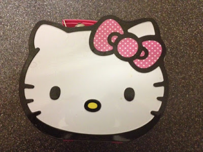
Look at that lunchbox. Isn't it awesome? Any five year old girl would love to take this to school, mine certainly does. It's bold, colourful, and nice and sturdy too. I was almost as pleased as she was with this purchase. But while this Hello Kitty lunchbox brings unending joy to my child, I have realised that it's not as great as it seems.
You see, the thing about most lunch items is that they have nice straight edges. They fit together nicely. Sandwich with yoghurt, with packet of crisps, with water bottle. They can all be arranged in many different ways within the confines of a regular rectangular lunchbox. But this thing is in the shape of Hello Kitty's face, and makes the whole thing a lot more difficult. It's smaller than your average lunchbox, and has all these weird juts and rounded edges around. It takes me a few tries to actually arrange the food in a way that's safe for transportation. Lunchboxes shouldn't be that way, they're created for ease of food transportation, but this one sees me having to jam the water bottle in at a diagonal and arrange the food around it. It's just awkward.
Who am I kidding, look at this awesome lunchbox. I can't stay mad at it. At least I got all the food in it in the end.
My rating: 4/5


Your mistake is putting the water bottle in there. I have genuinely never seen that done before.
ReplyDeleteThe school seems quite obsessed with water bottles. We have to provide an outside one and an indoor one, with an additional one if they have a packed lunch. There's no better way of keeping lunchbox and bottle together than cramming the latter into the former.
DeleteI have a confession to make...I am 30 years old this year and I have not 1 but 2 Hello Kitty lunch boxes! Not one like this though so perhaps I need a 3rd!
ReplyDelete